MAGGIE LEE DESIGNS

WEBSITE
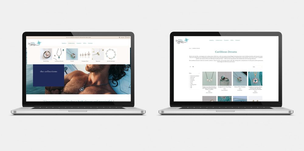
When Maggie approached me about revamping her website, I could sense her overwhelming dread. The project had been on her to-do list for years, but there were so many issues, she didn’t know where to start.
The design was outdated and she couldn’t make changes easily. There were hundreds of products and random collections, some duplicates, named inconsistently, tagged incorrectly, and lumped together in just a few categories, making it confusing and impossible to find what you were looking for. The photography needed editing, as did the copy. In a nutshell, the site needed a complete makeover to provide a better end-user experience and align with her brand aesthetic.

LAUNCH STRATEGY
Maggie’s website was ready to launch just in time for Cyber Monday. I created a launch and holiday marketing strategy to take advantage of a widely-known and publicized online shopping day. The strategy included primary objectives, timing, tactics, and potential promotions and messaging.

PROMOTIONAL POSTERS
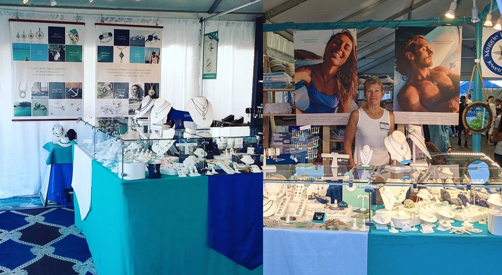
Maggie’s initial needs were a couple of posters she could display outside her shop and at events like the Annapolis Boat Show. Quickly, she realized the power of design and wanted her entire brand to feel like the posters I created. Over the years we have evolved the look, but everything we create is based on a consistent color palette, typography, and a strong grid.


PRINT COLLATERAL
Maggie uses a consistent template when she wants to promote a product line or target a specific demographic.

PRODUCT PHOTOGRAPHY
When we launched Maggie’s website, we explored ways to photograph her products that would differentiate her from her competitors. The palette and props serve as a link to her nautical inspirations.


PRINT ADVERTISING
The design format we created for advertising is very flexible. The grid works in a vertical or horizontal format, depending on the publication.
